
Uncategorised
How to Design Engraved Keyrings Well
Jun
A good engraved keyring has very little space to get things right, which is exactly why the design matters. If you are wondering how to design engraved keyrings that feel personal rather than rushed, the best place to start is not the font or the metal finish. It is the reason you are giving it. A keyring for a wedding usher needs a different tone from one for a new dad, a teacher, or a pet memorial keepsake.
Because keyrings are small, every choice carries more weight. A few well-chosen words can feel thoughtful and lasting. Too much text, a decorative font, or a layout that ignores the shape of the item can make the finished piece feel cluttered. The aim is simple – clear, meaningful engraving that suits the occasion and the person receiving it.
How to design engraved keyrings with the occasion in mind
The strongest designs usually begin with context. Before writing anything, think about who it is for, what the gift marks, and how formal or relaxed it should feel. An anniversary keyring can be sentimental. A Father’s Day keyring may be warmer and a little playful. A work leaving gift might need to stay simple and polished.
This matters because the same words can land differently depending on the moment. “Love you always” works beautifully for a partner or close family member, but it would feel out of place on a thank-you gift for a colleague. In the same way, a date alone might be perfect for a wedding keepsake, while a new home keyring may need an address or postcode to make the gift instantly meaningful.
If you are buying for someone practical, lean into usefulness as well as sentiment. A keyring that includes initials, a short message, or a significant date often feels more wearable day to day than a longer quote. If the recipient likes keepsakes, you can be more expressive, but it still helps to edit carefully.
Start with the message before the style
One of the most common mistakes is choosing the look first and trying to force the wording to fit afterwards. It works better the other way round. Decide what the engraving needs to say, then shape the design around that.
For most keyrings, shorter is stronger. Names, initials, dates, coordinates, brief thank-you messages, and tiny phrases tend to engrave well because they stay legible and balanced. A line such as “Best Dad Ever” or “Drive Safe” will usually read more clearly than a full sentence. If you want more detail, using two sides can help, but only if the product allows for it and the layout still feels clean.
There is also a difference between what is meaningful to you and what will read well on the item. A private joke may be lovely if it is short enough. A long quote from a card may be heartfelt, but on a small surface it can lose impact. Editing is part of the design process, not a compromise.
Choosing wording that fits the size
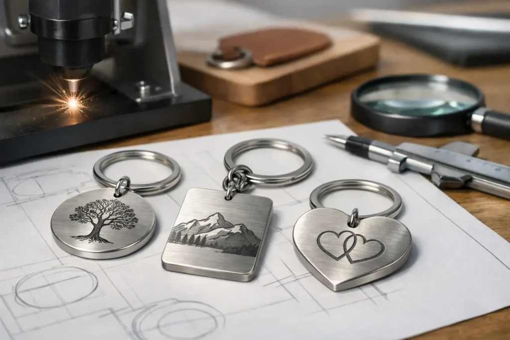
When thinking about how to design engraved keyrings, space is your biggest constraint. The shape of the keyring affects what will work. Rectangular styles often suit names, dates, or two-line messages. Circular keyrings are better for shorter wording or centred initials. Heart shapes naturally suit romantic or family gifting, but they still need restraint to avoid overcrowding.
As a general rule, one strong idea is better than three weaker ones. If you are deciding between a name, a date, and a long message, ask which detail matters most. Sometimes a first name and date are enough. Sometimes initials on one side and a short phrase on the other create a better result than trying to fit everything at once.
If you are ordering for an event, consistency matters too. Wedding party gifts, teacher gifts, or team presents look better when the wording follows the same pattern across all items. That could be a name on the front and role on the back, or initials paired with the year. A clear structure keeps a set looking intentional.
Fonts, layout and readability
An engraved gift should be easy to read without effort. Script fonts can look beautiful, but on a compact keyring they are not always the best choice, especially if the wording is longer or includes dates and numbers. Cleaner fonts often produce a sharper finish and make the personalisation feel smarter.
That does not mean every design should look plain. The right balance depends on the product and the message. A delicate script can suit a short romantic message. A neat block font may work better for names, coordinates, memorial dates, or everyday use. If the keyring is meant to be carried daily, legibility should win.
Layout matters just as much as the font itself. Centred text often suits circular or decorative shapes, while left-aligned or stacked text can work well on rectangular pieces. The important thing is breathing room. If the engraving sits too close to the edges, the design can feel cramped even when the wording is technically within the limit.
Capital letters need a little care as well. Full capitals can be useful for initials or short names, but they can look heavy if used for a longer message. Mixed case often feels more natural and easier to read.
Match the material and finish to the design
The material changes the mood of the gift. Stainless steel, leather, wood and acrylic all create a different impression, even with the same words engraved on them. If the gift is for everyday carrying, metal often gives a crisp, durable finish. If you want a softer or more rustic look, wood or leather can feel warmer.
Think about the recipient’s style. Someone who prefers practical accessories may like a simple metal tag with clean engraving. A partner or close family member might appreciate a shape with a little more sentiment. For memorial gifts, understated finishes often work best because they let the wording speak for itself.
There is a trade-off here. Decorative shapes and finishes can add charm, but they may reduce usable engraving space. Simpler styles usually give more room for text and tend to age well. If you are torn between the two, choose the option that keeps the message clear.
Design ideas for popular occasions
Different occasions naturally call for different engraving styles. For birthdays, names and milestone ages work well, especially if you want the gift to feel light and celebratory. For anniversaries, dates, initials and short romantic phrases are usually enough without overdoing it.
For Father’s Day or Mother’s Day, practical messages often have the most lasting appeal. “Love from Emily and Jack” or “Best Dad Ever” feels warm without becoming fussy. Teacher gifts benefit from straightforward appreciation, such as a name and thank-you line. Wedding gifts tend to work best when they look coordinated, especially across bridesmaids, groomsmen, ushers or parents of the couple.
Pet keyrings are another popular choice. A pet’s name, paw motif, adoption date, or a short memorial message can make a lovely keepsake. Here, keeping the design simple is especially effective. A small item can still carry a lot of meaning.
Common mistakes to avoid when designing engraved keyrings
The biggest issue is trying to say too much. Small personalised gifts are most effective when they are edited down to the detail that matters. Another frequent problem is choosing a fancy style that reduces clarity. What looks lovely in theory may not engrave as well in practice.
It is also worth double-checking spelling, dates and punctuation before ordering. Personalised gifts cannot always be corrected once production starts, so a final review matters. This is especially important for names, anniversary dates, Roman numerals, and coordinates.
Be careful with line breaks too. A phrase can change its look completely depending on where it splits. If possible, keep couples’ names together, avoid awkward breaks in short messages, and make sure numbers are easy to follow.
A simple way to finalise your design
If you want a straightforward approach, write three versions of your message – the full version, a shorter version, and the shortest possible version. Most of the time, the middle option is the one that works best. It says enough, leaves room for a clean layout, and gives the engraving space to stand out.
Then check whether the tone suits the recipient, whether the shape supports the wording, and whether the design will still look good after months of daily use. That last point is easy to miss. A keyring is handled, dropped in bags, carried in pockets and used constantly. The best designs are the ones that still feel right beyond the moment they are opened.
At Bespoke Engravers, we see again and again that the most successful personalised gifts are not always the longest or most decorative. They are the ones that feel considered. If your wording is clear, your layout is balanced, and your choice suits the person receiving it, a small engraved keyring can carry far more meaning than its size suggests.
When you are choosing the final design, trust the simple option if it feels right. A name, a date, or a few honest words are often all you need to make it memorable.
